Direct Mail Design Tips for Small Business: Make Your Mail Impossible to Ignore
Learn the direct mail design tactics that get Montana small businesses noticed and drive real responses in a crowded mailbox.
Your direct mail piece has about three seconds to prove it's worth opening. That's it. Three seconds before it either lands on the kitchen counter for a closer look or gets tossed in the recycling bin with the grocery store flyers.
Here's the thing: your offer might be incredible. Your targeting might be perfect. But if your design doesn't stop someone mid-sort through their mail stack, none of that matters. For Montana small businesses competing for attention in a mailbox full of catalogs and credit card offers, design isn't just decoration—it's the difference between a response and radio silence.
Let's talk about the direct mail design choices that actually move the needle for small businesses.
Start with the Envelope (Or Don't Use One at All)
The envelope is your first impression, and it's make-or-break. A plain white #10 envelope with a computer-printed label screams "junk mail" before it's even opened. But that doesn't mean you need a full-color envelope with fifty words of copy either.
Consider these envelope approaches:
- Hand-addressed or hand-written font: This works especially well for local businesses. A Billings coffee shop could hand-address 200 envelopes to nearby offices in an afternoon.
- Teaser copy that creates curiosity: "You left something at our store..." or "This expires in 7 days" gives people a reason to open.
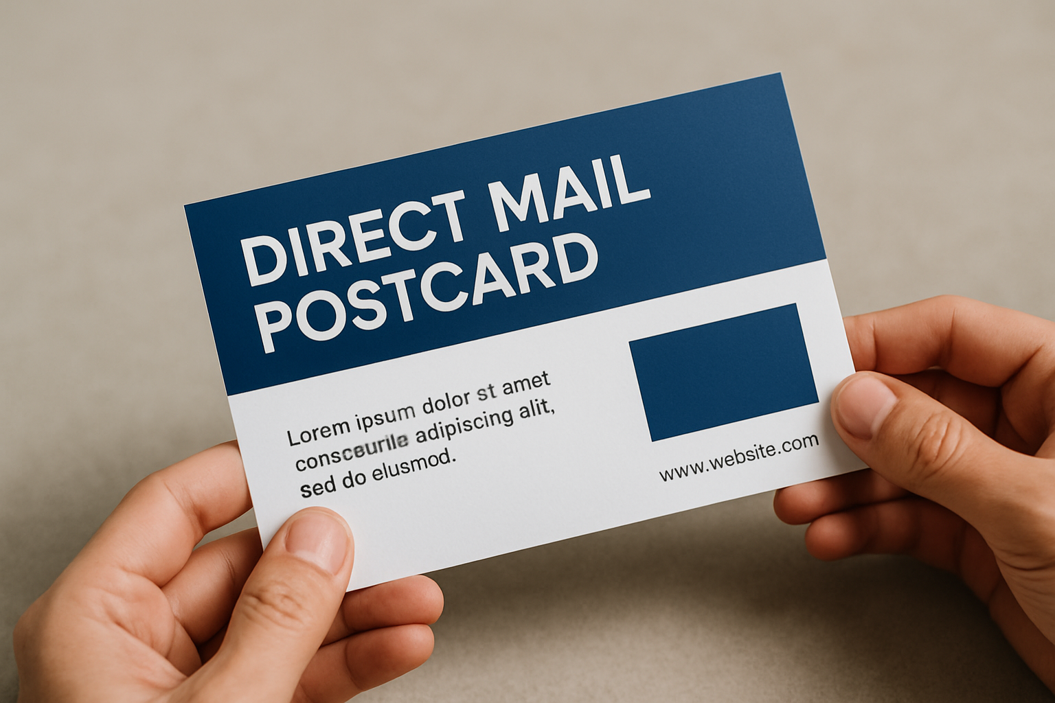
- Skip the envelope entirely: Postcards eliminate the opening decision and put your message front and center immediately.
Postcards are particularly smart for small businesses working with tight budgets—they cost less to print and mail, and they can't be ignored without at least a glance.
Nail Your Headline in 7 Words or Less
Once your mail is opened (or if it's a postcard, immediately visible), you need a headline that communicates value instantly. Not creativity for creativity's sake. Not a clever pun that requires three seconds of thought. Clear, immediate value.
Bad headline: "Spring Into Savings!"
Better headline: "$200 Off HVAC Tune-Ups This Month"
The second one tells a Billings homeowner exactly what they're getting and when. No guessing. No mental translation required.
Your headline should answer one question: "What's in this for me?" If someone has to read your body copy to figure out why they should care, your headline failed.
Design for Scanners, Not Readers
Nobody sits down with a cup of coffee to read your direct mail like it's the Sunday paper. People scan. They glance. They skim while standing over the recycling bin.
Design your piece for that reality:
- Use subheadings every few paragraphs: Break up text so people can find the parts that matter to them
- Bullet points are your friend: Lists are easier to scan than paragraphs
- Highlight key information: Bold your offer amount, deadline, or unique benefit
- White space matters: Cramming every inch with text makes people's eyes glaze over
The goal isn't to make people read every word. The goal is to make the important words impossible to miss.
Color Psychology: Keep It Simple and Strategic
You don't need a degree in color theory, but you should understand the basics. Colors trigger emotional responses, and different industries have different color expectations.
For Montana small businesses:
- Blue suggests trust and stability: Good for financial services, insurance, medical practices
- Red creates urgency: Sales, limited-time offers, restaurant specials
- Green signals growth and health: Landscaping services, wellness businesses, environmental companies
- Orange feels friendly and approachable: Retail, entertainment, children's services
More important than choosing the "right" color is being consistent with your brand. If your logo and website are navy and gold, your direct mail should be too. Brand consistency builds recognition over time, which matters a lot when you're thinking about your overall direct mail strategy.
Also: limit yourself to 2-3 colors maximum. More than that looks chaotic and amateur.
Images That Actually Support Your Message
Stock photos of people shaking hands or someone pointing at a laptop? Please don't. Those images add nothing and scream "generic business content."
Better image choices for small businesses:
- Your actual product: A clear, high-quality photo of what you're selling
- Your team or storefront: Puts a local face to your business
- The end result: A before-and-after for contractors, a finished project for designers
- Your customers using your product: Real people, not models
If you're a Billings HVAC company, show a photo of your van with the Rimrocks in the background. If you're a bakery, show your actual pastries with flour on the counter. Local and real beats polished and generic every time.
One strong image beats four mediocre ones. Don't clutter your design trying to show everything.
Your Call-to-Action Needs to Be Impossible to Miss
You'd be shocked how much direct mail gets designed without a clear next step. Or with a call-to-action buried at the bottom in 8-point font. Your CTA should be the second-most prominent element on the page after your headline.
Specific beats vague:
- Bad: "Contact us today!"
- Better: "Call 406-555-1234 for your free estimate"
- Even better: "Text DECK to 406-555-1234 for $500 off spring deck builds"
Make it as easy as possible for someone to take action. Phone number in large, readable font. QR code that goes directly to a landing page, not your homepage. Website URL that's short and memorable. A text-to-respond option for people who hate phone calls.
And here's a trick: give people a deadline. "Offer expires March 15" creates urgency. Open-ended offers get filed away and forgotten.
Personalization: Go Beyond "Dear Valued Customer"
If you're doing proper list segmentation, you should know something about who you're mailing to. Use that information in your design.
Variable data printing lets you customize pieces without printing tiny quantities:
- Use their actual name in the headline
- Reference their neighborhood or zip code
- Show different offers based on past purchases
- Include a personalized discount code
Even small personalization touches increase response rates. A Billings auto shop could send different postcards to truck owners versus sedan owners. A gym could send different offers to former members versus people who've never joined.
The technology is accessible now. You don't need enterprise-level budgets to do this.
Size and Format: When Bigger Actually Is Better
Standard 4x6 postcards are cheap and effective. But sometimes standing out means being literally bigger than everything else in the mailbox.
Consider these format options:
- 6x9 or 6x11 postcards: Harder to ignore, more room for your message
- Fold-over or tri-fold pieces: Create interaction and let you tell a longer story
- Dimensional mail: Boxes or padded envelopes get opened at a much higher rate
- Odd sizes or shapes: Square envelopes or custom die-cuts catch attention
Yes, larger and specialty formats cost more. But if you're comparing the ROI of direct mail to digital channels, sometimes spending an extra 50 cents per piece doubles your response rate, making it absolutely worth it.
Don't Forget the Back
If you're doing a postcard, you have two sides. Use both. The back is perfect for:
- Additional product photos or details
- Testimonials or reviews
- Your full contact information and hours
- A map to your location
- Secondary offers or cross-sells
Never leave the back blank or filled with nothing but your mailing indicia. That's wasted real estate.
Test, Measure, Repeat
Here's the truth: you won't get everything perfect on your first campaign. That's fine. Direct mail is measurable, which means you can improve.
Test different elements:
- Headline A vs. Headline B
- Postcard vs. letter in envelope
- Photo vs. illustration
- One offer vs. multiple offers
- Different call-to-action placements
Track what you're testing using unique phone numbers, QR codes, or landing pages for each version. Then look at your actual campaign metrics to see what worked.
Small businesses in Montana have an advantage here—your market is contained enough that you can test on smaller segments before scaling up.
Work with a Designer (Or At Least Use Good Templates)
Look, we're all for DIY when it makes sense. But direct mail design is one area where trying to save a few hundred dollars on design often costs you thousands in lost responses.
If you're doing this yourself, at minimum:
- Use Canva or similar tools with professional templates
- Hire a designer on Fiverr or Upwork for a one-time template creation
- Get feedback from people outside your business before printing
Better option: Work with a marketing agency that understands direct mail design and can connect it to your broader strategy. At Agency 220, we've designed direct mail campaigns for Montana businesses that actually get opened and acted on—because we know the difference between design that looks pretty and design that drives results.
Take Your Direct Mail Design from Ignored to Irresistible
Good direct mail design isn't about following every trend or using the most expensive printing techniques. It's about making strategic choices that get your piece noticed, understood, and acted on within seconds.
Start with these fundamentals: a clear headline that communicates value, a scannable layout with plenty of white space, images that support your message, and a call-to-action that's impossible to miss. Get those right, and you're ahead of 80% of the direct mail hitting Montana mailboxes.
Ready to create direct mail that actually works for your small business? Agency 220 helps Billings businesses design and execute direct mail campaigns that earn attention and drive measurable results. Let's talk about what a well-designed campaign could do for your business. Get in touch.