7 Print Ad Design Mistakes to Avoid That Are Costing Montana Businesses Sales
Avoid these seven print ad design mistakes that waste money and kill response rates for Montana small businesses.
Your print ad just cost you $800 to run in the local paper. You designed it yourself to save money. Now it's buried on page seven, and nobody's calling. The phone stays silent, the coupon code goes unused, and you're wondering if print advertising even works anymore.
Here's the truth: print ads still convert—when they're designed right. But most small business owners make the same avoidable mistakes that turn a potential customer magnet into expensive wallpaper. Let's fix that.
Table of Contents
Cramming Too Much Information Into One Ad
Walk into any coffee shop in Billings and flip through the local magazine. You'll spot them immediately—the ads that look like someone dumped an entire website onto a quarter-page space.
Every service listed. Three different phone numbers. Multiple addresses. A paragraph explaining the company history. Social media icons. An essay about quality and service.
Nobody reads any of it.
Print ads work best when they communicate one clear message to one specific audience. Your plumbing company doesn't need to advertise water heaters, drain cleaning, and bathroom remodels in the same ad. Pick one service, make one compelling offer, and drive people to one action.
Think of your print ad as a billboard, not a brochure. If someone can't grasp your core message in three seconds, you've already lost them.
The Fix
- Choose one service or product to feature
- Write one benefit-focused headline
- Include one clear offer
- Give one way to respond
When you're developing a broader print advertising strategy, you can rotate different messages across multiple ad placements. But each individual ad needs focus.
Using Weak Headlines That Don't Grab Attention
"Quality Service Since 1987." "Family Owned and Operated." "Your Trusted Local Provider."
These headlines say nothing. They're the advertising equivalent of small talk—polite, forgettable, and completely ineffective at stopping a reader mid-scroll.
Your headline is the only chance you get. If it doesn't promise a specific benefit or spark curiosity, readers will skip right past your ad to the article they actually want to read.
Compare these:
Weak: "Professional Landscaping Services"
Strong: "Turn Your Brown Lawn Green in 30 Days or Your Money Back"
Weak: "Montana's Premier HVAC Company"
Strong: "Cut Your Heating Bill by 40% This Winter"
The strong headlines speak directly to what the customer wants. They're specific. They make a promise. They give readers a reason to keep reading.
The Fix
- Lead with the customer's problem or desire
- Use numbers when possible (percentages, timeframes, dollar amounts)
- Test headlines by asking: "Would I stop scrolling for this?"
- Avoid industry jargon that means nothing to regular people
Publishing Low-Quality Images That Scream Amateur
You grabbed a photo from your phone. It looked fine on the screen. Then it printed as a blurry, pixelated mess that makes your business look like it operates out of a garage.
Print requires higher resolution than digital. That Facebook profile picture won't cut it. Neither will that photo you stretched to fill the space.
Image quality directly impacts perceived credibility. A restaurant with grainy food photos? Hard pass. A realtor with a pixelated headshot? Probably not selling million-dollar homes.
The Fix
- Use images at 300 DPI minimum for print
- Hire a professional photographer for your primary marketing photos
- Never stretch or enlarge images beyond their original size
- Invest in a few stock photos from reputable sources if needed
- Ask your publication about their image requirements before designing
This applies whether you're placing ads in local newspapers or niche magazines. Each publication has specific technical requirements, and ignoring them costs you money and credibility.
Forgetting the Most Important Element: A Clear Call-to-Action
Beautiful design. Compelling headline. Relevant image. Then... nothing. No next step. No reason to act now. No way to respond.
Your ad isn't art. It's a sales tool. Every ad needs to tell readers exactly what to do next.
"Call now." "Visit our showroom this weekend." "Scan this QR code for 20% off." "Bring this ad in for a free consultation."
The best calls-to-action combine clarity with urgency. They make it dead simple to respond, and they give readers a reason to do it today instead of someday.
The Fix
- Make your CTA the most visually prominent element after the headline
- Use action verbs (call, visit, scan, claim, save)
- Add a deadline or limited quantity when authentic
- Provide one primary way to respond (don't list phone, email, website, and social media)
- Consider QR codes for easy mobile response
A strong CTA also helps with tracking your print advertising effectiveness. When you know exactly how people responded, you can measure what's working.
Ignoring White Space and Visual Hierarchy
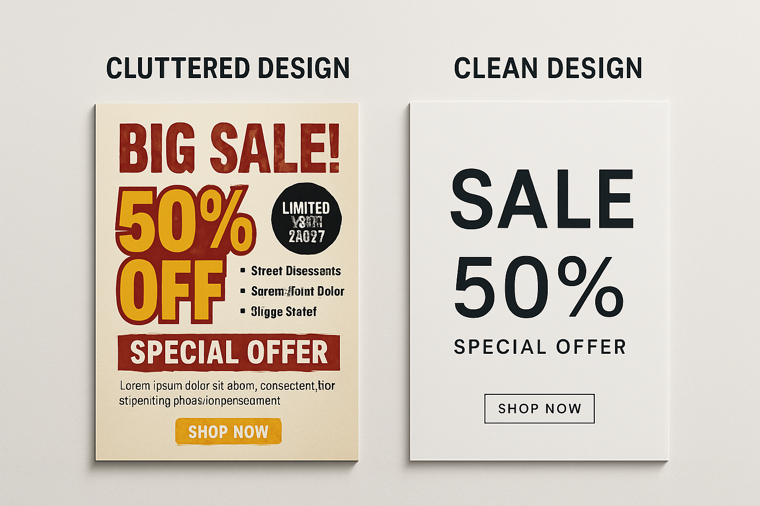
White space isn't wasted space. It's breathing room. It's what guides the eye through your ad in the order you want.
Amateur designers fear empty space. They fill every inch with text, borders, images, and graphics. The result looks cluttered, feels overwhelming, and gets ignored.
Professional designers embrace white space. They use it strategically to:
- Draw attention to key elements
- Create a clean, premium look
- Improve readability
- Make complex information feel digestible
Look at ads from major brands. Notice all that empty space? That's intentional. It makes the headline pop. It lets the product image shine. It makes the whole ad feel more expensive and trustworthy.
The Fix
- Leave margins around the edges of your ad
- Put space between different elements
- Resist the urge to fill every corner
- Use size and placement to show what's most important
- Remember: if everything's emphasized, nothing is
Choosing the Wrong Fonts for Print
Comic Sans. Papyrus. Brush Script. That weird decorative font you found that "looks cool."
Stop.
Fonts carry meaning. They set tone. They affect readability. And in print, where resolution and size matter, font choice can make or break your ad.
Decorative fonts might work for a logo or headline, but body copy needs something clean and readable. And mixing too many fonts makes your ad look like a ransom note.
The Fix
- Stick to two fonts maximum (one for headlines, one for body copy)
- Use serif fonts for traditional, trustworthy feel
- Use sans-serif fonts for modern, clean appearance
- Ensure body copy is at least 10-point size
- Test readability by stepping back from your design
When in doubt, go boring. Times New Roman and Arial aren't exciting, but they're readable. And readable ads get read.
Running Ads Without Any Way to Track Results
You spent $1,200 on a print ad campaign. Business picked up a little last month. Was it the ads? The weather? Random luck? You have no idea.
This is the mistake that costs the most money long-term. Without tracking, you can't learn. You can't improve. You can't know if you should run that ad again or try something completely different.
Print tracking isn't as precise as digital, but it's absolutely possible:
- Use unique phone numbers for each publication
- Create specific landing page URLs
- Add QR codes that track scans
- Include coupon codes that identify the source
- Train staff to ask "How did you hear about us?"
The businesses that succeed with print advertising are the ones who test, measure, and refine. They don't just hope their ads work—they know.
Design Smarter, Not Harder
Print advertising still delivers results for Montana businesses—when the design doesn't get in the way of the message.
Avoid these seven mistakes and you're already ahead of 80% of the local ads competing for attention. Combine smart design with the right placement strategy, and print becomes a reliable lead generator instead of a budget drain.
Not sure if your current print ads are making these mistakes? Agency 220 offers free marketing consultations for Montana businesses. We'll review your existing ads, show you what's working (and what's not), and create a plan to turn print into profit. Contact us today to schedule your review.
Frequently Asked Questions