Homepage Layout Ideas for Small Business: 7 Designs That Actually Convert
Your homepage has three seconds to convince visitors they're in the right place. Here's how to design a layout that actually converts browsers into customers.
Your homepage has about three seconds to convince a visitor they're in the right place. That's it. Three seconds before they hit the back button and try your competitor instead.
Most small business homepages fail this test because they're either too cluttered, too vague, or built around what the owner likes instead of what actually works. Your homepage isn't a digital brochure—it's a conversion tool. And in 2026, the businesses winning online are the ones treating it that way.
Let's look at homepage layout ideas for small business that turn browsers into customers, without requiring a design degree or a massive budget.
Table of Contents
Why Your Homepage Layout Matters More Than You Think
Layout dictates how quickly someone understands what you do and whether you can help them. A confusing layout creates work for your visitor. And people don't work hard on websites—they leave.
Think about the last time you landed on a homepage and couldn't immediately figure out what the company did. You probably left within seconds. That's exactly what's happening on poorly designed homepages every single day.
A strategic layout guides the eye naturally from one section to the next, answers questions before they're asked, and moves visitors toward a specific action. Just like how regular dental exams follow a systematic approach to catch problems early, your homepage should follow a proven structure that catches visitors' attention and holds it.
The Hero Section: Your Make-or-Break Moment
Your hero section—that big visual area at the top of your homepage—needs to answer three questions instantly:
- What do you do?
- Who is it for?
- What should I do next?
The best hero sections use a clear headline that states the benefit (not just what you are), a supporting subheadline that adds context, and one prominent call-to-action button.
Hero Layout Options That Work
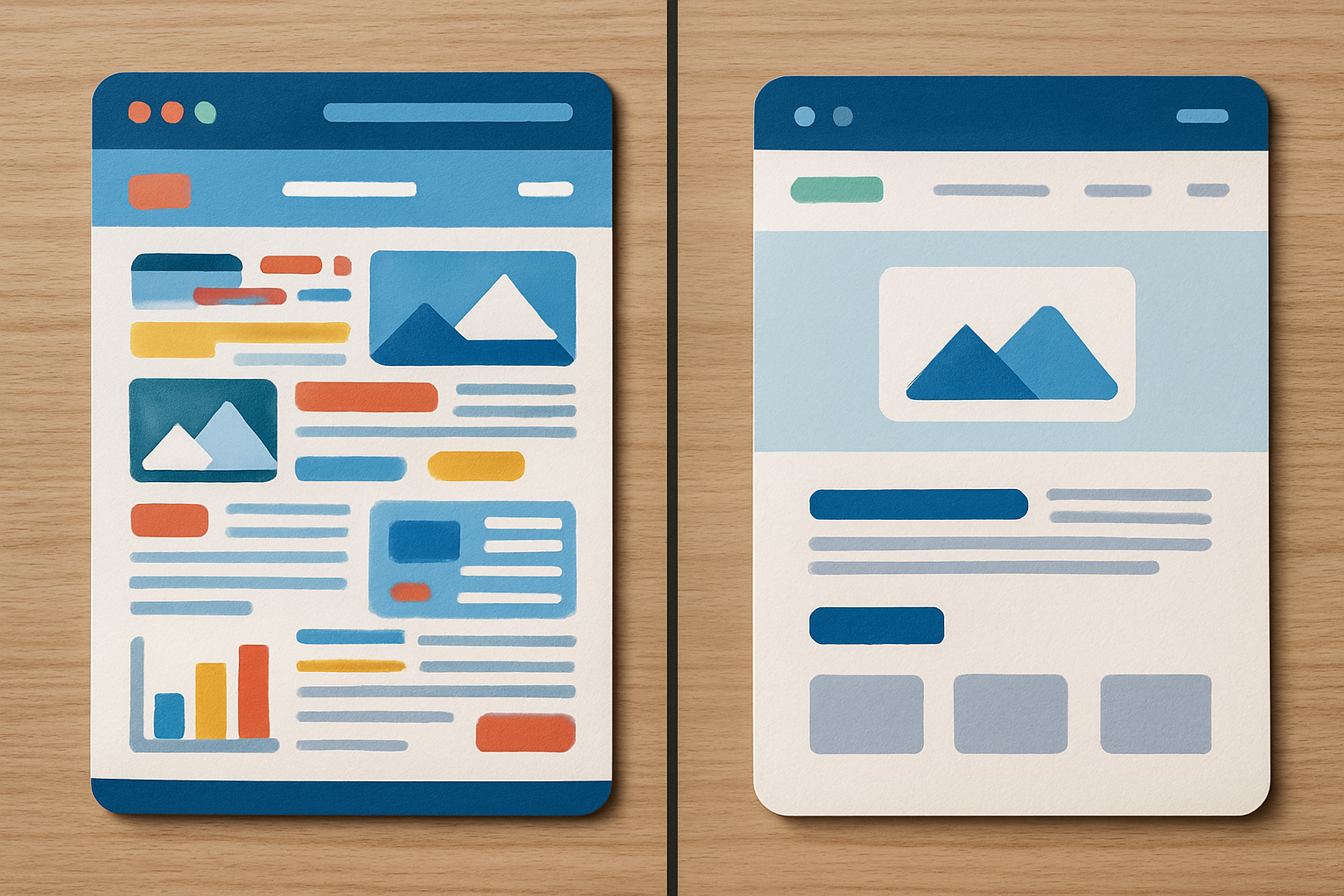
Full-width with centered text: Clean, modern, puts all attention on your message. Works especially well for service businesses.
Split layout (text left, image right): Balances copy with visuals. Great when you have a strong product photo or team image that builds trust.
Video background with overlay: High-impact but needs to load quickly. Use sparingly and ensure mobile fallback to a static image.
For a Montana-based small business, your hero section might highlight your local expertise and immediate value. Skip generic stock photos—real images of your team, your work, or your Billings location build more credibility.
Service Preview Layouts That Drive Clicks
Right below your hero, visitors need to see what you actually offer. The goal isn't to explain everything—it's to give enough information to encourage the next click.
A three-column card layout works well for most small businesses. Each card should include:
- A descriptive icon or image
- A clear service name
- One sentence explaining the benefit
- A "Learn More" link
If you offer more than three core services, resist the urge to cram them all in. Feature your most popular or profitable three, then add a "View All Services" link. Similar to how cosmetic dentistry practices showcase their most requested procedures first, your homepage should prioritize what people actually want.
Alternative layout: Use a tabbed interface where visitors click between service categories. This works when you have distinct service lines (like commercial vs. residential, or different industry specializations).
Trust Signal Placement: Where to Put Social Proof
Trust signals—testimonials, reviews, client logos, awards, certifications—tell visitors you're legitimate. But dump them all at the top and you create visual chaos.
Strategic placement matters. Here's what works:
Logo bar: Place a simple row of recognizable client or partner logos between your hero and services section. No need for fancy animations—just clean, aligned logos with a headline like "Trusted by Montana Businesses."
Testimonial section: Position this after your services preview. Use a rotating carousel (that doesn't auto-play—let visitors control it) or a simple grid of 2-3 testimonials with photos and full names.
Stats or numbers: If you have compelling numbers (years in business, projects completed, five-star reviews), create a simple four-column stats section. Keep it scannable.
The key is spreading trust signals throughout your layout rather than clustering them. Just as family dental checkups build trust through consistent care over time, your homepage builds credibility through strategically placed proof points.
Call-to-Action Strategy: One Primary Goal
Here's where most small business homepages fall apart: trying to get visitors to do too many things at once.
Your homepage should have one primary conversion goal. Not five. One.
That might be:
- Schedule a consultation
- Request a quote
- Call now
- Download a guide
- Start a free trial
Yes, you can have secondary CTAs (like "Learn More" buttons on service cards or a newsletter signup in the footer). But one action should dominate visually and appear multiple times as visitors scroll.
CTA Placement Pattern
Follow this pattern for maximum conversions:
- Hero section: Primary CTA button
- After services section: Primary CTA button
- After testimonials: Primary CTA button
- Footer: Primary CTA plus secondary options
Use the same button color, same copy, same action throughout. Consistency removes friction. When someone finally decides they're ready, that familiar button is right there waiting.
Mobile-First Layout Considerations
More than 60% of web traffic comes from mobile devices. Your homepage layout needs to work perfectly on a phone first, desktop second.
Mobile-first layout principles:
Stack everything vertically. What sits side-by-side on desktop should stack neatly on mobile. Test that your hero text is readable without zooming and your CTA buttons are thumb-sized.
Simplify navigation. A hamburger menu is fine for mobile. What matters is that your most important pages (blog, services, contact) are easy to access.
Reduce cognitive load. Mobile users are often multitasking or on-the-go. Your mobile homepage should be even more focused than desktop—fewer words, bigger headlines, clearer hierarchy.
Optimize images. Large hero images that look great on desktop can kill mobile load times. Use responsive images that serve smaller files to mobile devices.
A good test: Pull up your homepage on your phone right now. Can you understand what you do and take action within 10 seconds? If not, your mobile layout needs work.
Common Homepage Layout Mistakes to Avoid
Even with good intentions, small businesses make predictable homepage layout mistakes that tank conversions.
Slider overload: Auto-rotating carousels are proven conversion killers. People either ignore them or get frustrated trying to read them. If you must use a slider, make it user-controlled and limit it to three slides maximum.
Wall of text: Long paragraphs explaining your company history in the hero section. Nobody reads this. Lead with benefit-driven headlines, save the backstory for your team page.
Unclear value proposition: Generic headlines like "Welcome to Our Website" or "Quality Service Since 1995" tell visitors nothing. Your headline should make your unique value instantly clear.
Too many competing elements: Pop-ups, chat widgets, notification bars, and multiple CTAs all fighting for attention. Each element you add competes with everything else. Be ruthless about what actually needs to be there.
No white space: Cramming every pixel with content creates visual claustrophobia. Strategic white space guides the eye and makes your homepage feel premium, not cluttered. Think about how consistent dental hygiene prevents overwhelming problems—consistent use of white space prevents overwhelming layouts.
Your Homepage is Never Finished
The best homepage layout ideas for small business are the ones you actually test and refine. What works for a law firm might not work for a restaurant. What works in Billings might need adjustment for a different market.
Start with one of these proven layouts, launch it, then watch what happens. Use tools like heatmaps to see where people actually click, review your analytics to see where people drop off, and ask real customers what confused them.
Your homepage should evolve as your business grows and as you learn what resonates with your specific audience. The layout that converts best is rarely the first version you build.
If you're a small business owner staring at a homepage that isn't working, you don't need to start from scratch. You need a strategic layout that puts the right elements in the right order, optimized for how real people actually use websites. At Agency 220, we build homepage layouts that turn visitors into customers—not through tricks or hacks, but through clear, conversion-focused design principles that work.
Ready to turn your homepage into your hardest-working sales tool? Let's talk about what that looks like for your specific business.