Mobile Responsive Design for Small Business Websites: Why Your Site Can't Afford to Ignore It
Mobile responsive design isn't optional anymore. Here's why your small business website needs it and how to get it right in 2026.
Here's the uncomfortable truth: if your small business website doesn't work flawlessly on a phone, you're losing customers before they even know what you offer. In 2026, more than 65% of web traffic comes from mobile devices, and that number climbs higher every quarter. When someone taps your site from a search result and has to pinch, zoom, and squint just to read your hours or find your contact button, they're gone—probably to your competitor whose site loads perfectly on their screen.
Mobile responsive design for small business websites isn't a nice-to-have feature anymore. It's the difference between a site that converts visitors into customers and one that sends them running. Let's break down exactly what makes a website truly mobile-responsive and how you can make sure your business doesn't get left behind.
What Mobile Responsive Design Actually Means
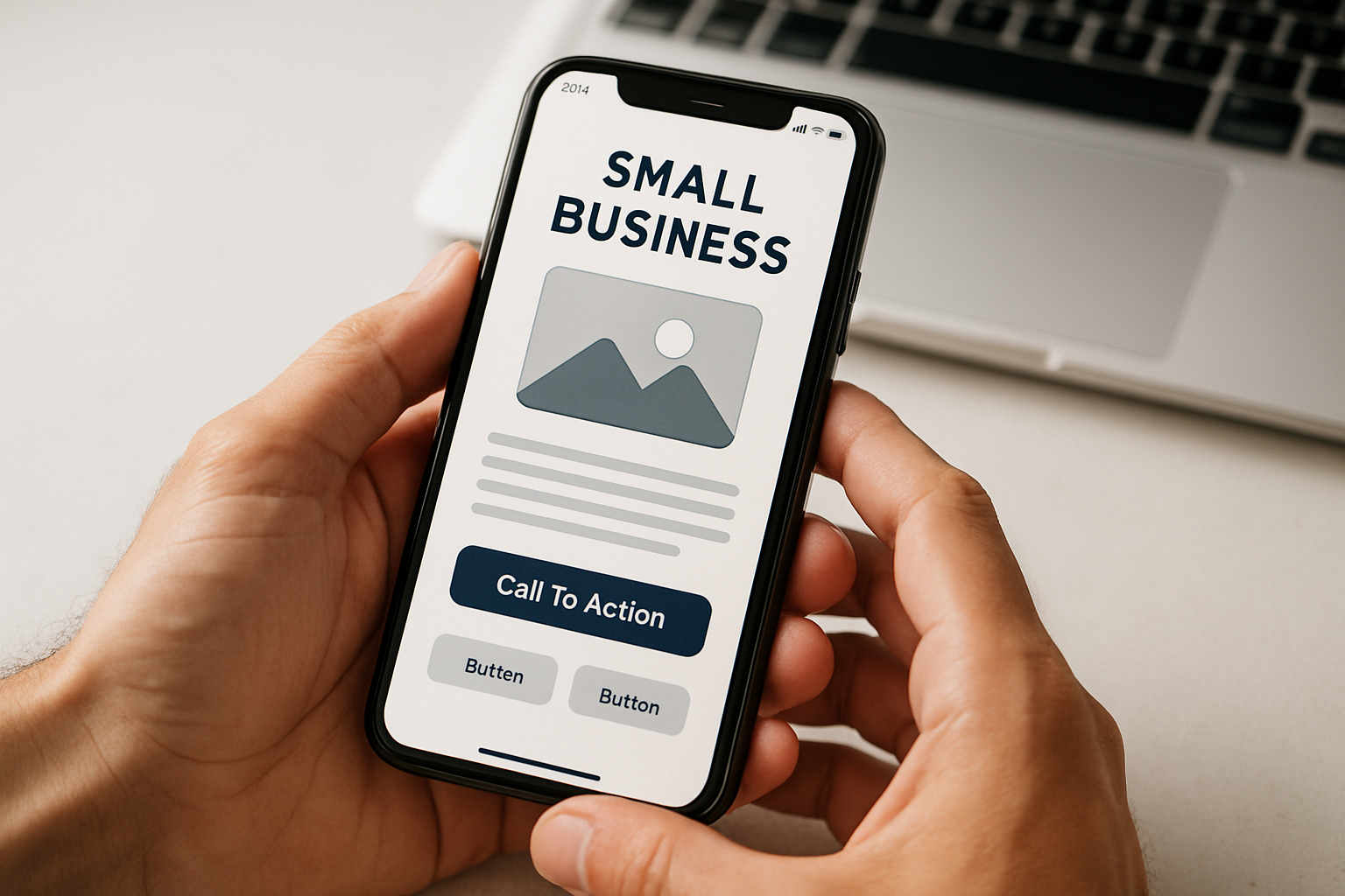
Mobile responsive design means your website automatically adjusts its layout, images, and functionality to fit whatever screen size someone's using—whether that's a smartphone, tablet, or desktop monitor. The content reflows, buttons become thumb-friendly, and navigation condenses into something manageable on a smaller screen.
Think of it like water taking the shape of its container. Your site should look intentionally designed for every device, not like a shrunken-down version of your desktop site crammed onto a phone screen.
The key components include:
- Flexible grids that resize content proportionally
- Images that scale without breaking layout or loading slowly
- Touch-friendly buttons and links (nothing worse than fat-fingering a tiny "Contact Us" button three times)
- Readable text without zooming—typically 16px minimum font size
- Simplified navigation that doesn't require a microscope
Why Google Cares About Your Mobile Site (And Why You Should Too)
Since 2019, Google has used mobile-first indexing. That means when Google's bots crawl and rank your site, they're looking at the mobile version first. If your mobile site is a mess, your rankings suffer—even for people searching on desktop computers.
This isn't just about SEO theory. Small businesses in Billings and across Montana have seen their traffic plummet after Google updates specifically because their sites weren't mobile-optimized. One local shop we worked with saw a 40% drop in organic traffic until we fixed their mobile experience. Within two months of implementing proper responsive design, they recovered and exceeded their previous traffic levels.
Beyond rankings, there's the user experience factor. A slow-loading or poorly functioning mobile site increases your bounce rate, which signals to Google that your site doesn't satisfy searcher intent. It becomes a vicious cycle: bad mobile experience → high bounce rate → lower rankings → fewer visitors seeing your site at all.
The Real Business Impact of Mobile Responsiveness
Let's talk money. According to recent data, 57% of users say they won't recommend a business with a poorly designed mobile site. More importantly, 30% will abandon a purchase entirely if the experience isn't optimized for mobile.
For small businesses, every lost visitor represents actual revenue walking out the door. If you're running a service business, that's a potential client who called your competitor instead. If you're in retail, that's a sale that went to Amazon because your checkout process was too frustrating on mobile.
We've seen this firsthand with clients. Just like practices offering professional teeth whitening in Billings, MT need to make their services easily discoverable and bookable on mobile, your business needs the same level of accessibility. When someone searches for what you offer while they're out and about, you have about three seconds to prove your site is worth their time.
Common Mobile Design Mistakes Small Businesses Make
Even businesses that think they have a mobile-responsive site often get tripped up by these issues:
Tiny, unclickable buttons: Your "Schedule Appointment" or "Get a Quote" buttons need to be at least 44x44 pixels—the size of an average fingertip. We see this constantly with local businesses whose contact forms are nearly impossible to complete on a phone.
Slow load times: Mobile users are often on cellular connections, not WiFi. If your site takes more than three seconds to load, 53% of mobile visitors will leave. Huge unoptimized images are usually the culprit. Much like how consistent dental hygiene can help prevent crushing dental issues, consistent image optimization prevents crushing performance problems.
Pop-ups that won't close: Nothing enrages a mobile user faster than a pop-up with an X button too small to tap or positioned off-screen. Google actually penalizes intrusive interstitials on mobile.
Horizontal scrolling: If users have to scroll sideways to see your content, your site isn't responsive—it's broken. Content should always fit within the viewport width.
Non-mobile-friendly navigation: That beautiful mega-menu you have on desktop? It probably becomes an unusable mess on mobile. Hamburger menus (those three-line icons) work well when implemented correctly, giving users access to your full sitemap without cluttering the screen.
How to Check If Your Site Is Actually Mobile Responsive
Testing your site is straightforward. Here's what to do right now:
- Pull out your phone and visit your site. Seriously—do this first. Click around. Try to fill out a form. Attempt to find your contact information. If you're frustrated, your customers definitely are.
- Use Google's Mobile-Friendly Test tool (just search for it). It'll tell you exactly what issues Google sees.
- Check your site on multiple devices if possible—different phones render things differently. An iPhone and an Android device can show different experiences.
- Test your site speed using Google PageSpeed Insights. Aim for a mobile score above 80.
- Look at your analytics. If your mobile bounce rate is significantly higher than desktop (we're talking 10+ percentage points), that's a red flag.
Practical Steps to Make Your Site Mobile Responsive
If you've discovered your site isn't up to par, here's your action plan:
For existing sites: If your site was built in the last five years and uses a modern content management system, you might just need a theme update or some CSS adjustments. Many small business sites use WordPress or similar platforms where switching to a responsive theme is relatively simple. Similar to how cosmetic dentistry trends in 2026 focus on modern, effective solutions, your site needs modern, effective responsive design.
For older sites: If your site was built before 2015 or uses outdated technology (Flash, anyone?), you probably need a rebuild. This sounds intimidating, but it's an investment that pays for itself in increased conversions and better search rankings.
Key elements to prioritize:
- A mobile-first navigation system that's thumb-friendly
- Properly sized, optimized images that load quickly
- Touch-optimized forms with large input fields
- Click-to-call functionality for your phone number
- Visible, accessible contact information—don't make people hunt for it
If you're working with a professional team, make sure mobile responsiveness is explicitly part of the project scope. Not all web developers prioritize mobile equally, so be specific about your expectations.
Mobile Responsiveness and Local Search
For small businesses in Billings and throughout Montana, mobile responsiveness directly impacts your local search performance. When someone searches "near me" or includes a location in their search, they're almost always on a mobile device.
Your mobile site needs to make it dead simple for local customers to:
- Find your address and get directions
- Call you with one tap
- See your hours immediately
- Understand what services you offer
- Take the next step, whether that's booking an appointment or visiting your location
We've found that businesses serving local markets—from restaurants to professional services—see the biggest immediate impact from mobile optimization. When you're competing for customers in Billings, having the most mobile-friendly site in your category gives you a measurable advantage.
Making Mobile Responsive Design Work for Your Business
Mobile responsive design for small business websites isn't just about avoiding Google penalties or keeping up with trends. It's about meeting your customers where they are—which is increasingly on their phones, searching for solutions while they're on the go.
The businesses that win in 2026 are the ones that make mobile visitors feel like the website was built specifically for them. Every element should work effortlessly, every page should load quickly, and the path to becoming a customer should be obvious and friction-free.
If your site isn't there yet, you're not just missing out on potential customers today—you're falling further behind competitors who are investing in mobile-first experiences. The good news? Once you fix these issues, the improvements are lasting and compound over time through better rankings, lower bounce rates, and higher conversion rates.
At Agency 220, we help small businesses in Billings and beyond create websites that work beautifully on every device. If you're not sure where your site stands or need help implementing responsive design, check out our blog for more insights or reach out to discuss your specific situation. Your mobile visitors are waiting—and they're not patient.