Website Design Best Practices for Small Business: The 2026 Guide That Converts Visitors Into Customers
Stop losing customers to poor website design. Learn the proven best practices that turn your small business site into a conversion machine.
Your website isn't just losing visitors—it's bleeding potential revenue every single day. In Billings and beyond, small businesses are watching competitors with better-designed sites capture customers who should have been theirs. The difference between a website that converts and one that drives people away often comes down to a handful of design decisions you can fix starting today.
This isn't about chasing trends or spending thousands on flashy graphics. The website design best practices for small business that actually move the needle are practical, proven, and surprisingly straightforward. Whether you're launching your first site or finally fixing the one that's been underperforming for years, this guide covers everything you need to turn your website into your hardest-working employee.
Table of Contents
Mobile-First Design: Why Your Phone Screen Matters More Than Your Desktop
Over 60% of web traffic comes from mobile devices in 2026, and that number climbs higher every quarter. If your website looks perfect on your office computer but turns into a jumbled mess on a smartphone, you're literally turning away the majority of your potential customers before they even see what you offer.
Mobile-first design means building your site for small screens first, then scaling up to desktop. This approach forces you to prioritize what actually matters and strip away the clutter that bogs down so many small business websites.
Key Mobile Design Elements
- Touch-friendly buttons: Make clickable elements at least 44x44 pixels so fingers can tap them easily without accidentally hitting the wrong thing
- Readable text: Use 16px as your minimum font size—nobody wants to pinch and zoom to read your content
- Simplified menus: Hamburger menus work fine on mobile, but make sure they're obvious and easy to open
- Vertical scrolling: Design content to flow naturally down the page rather than forcing horizontal movement
Test your site on actual phones, not just browser resize tools. The experience differs significantly, and you need to know exactly what your customers see when they pull up your site while standing in line at the grocery store.
Loading Speed: The Three-Second Rule That Makes or Breaks Sales
Every second your website takes to load costs you customers. Google reports that 53% of mobile users abandon sites that take longer than three seconds to load. For a small business, that's not just a statistic—it's lost revenue you'll never get back.
Speed optimization sounds technical, but the biggest wins come from straightforward fixes most businesses ignore.
Speed-Boosting Strategies
Compress your images before uploading them. That gorgeous 5MB hero image might look stunning, but it's killing your load time. Use tools like TinyPNG or Squoosh to shrink files to under 200KB without noticeable quality loss.
Choose quality hosting. The $3/month bargain hosting might seem smart, but slow servers mean slow sites. Invest in hosting that includes CDN (content delivery network) services to serve your content from locations closer to your visitors.
Minimize plugins and third-party scripts. Every Facebook pixel, chat widget, and analytics tracker adds load time. Only keep the tools that directly impact your business goals.
Enable browser caching so returning visitors load your site faster on subsequent visits. Your hosting provider or website platform should have straightforward settings for this.
Clear Navigation: Getting Visitors Where They Need to Go
Confusing navigation kills conversions faster than almost anything else. When visitors can't find what they're looking for within seconds, they leave. Your sitemap might be comprehensive, but if your main navigation doesn't make sense at a glance, it doesn't matter.
Small business websites work best with simple, flat navigation structures. Aim for 5-7 main menu items maximum. If you need more, you probably need to reorganize your content strategy.
Navigation Best Practices
Use clear, descriptive labels instead of clever wordplay. "Services" beats "What We Do" every time. Your visitors shouldn't need to guess what they'll find when they click.
Put your most important pages in the main navigation bar. Services, About, Contact—these core pages should always be one click away from anywhere on your site.
Include search functionality if you have more than 20 pages. A search bar gives visitors a backup option when they can't immediately spot what they need.
Add breadcrumbs on deeper pages so visitors always know where they are in your site structure and can easily backtrack. Much like the detailed navigation you'd find on our blog archive, breadcrumbs help users orient themselves.
Compelling CTAs: Turning Browsers Into Buyers
Your call-to-action buttons are where interest transforms into action. Weak CTAs leave money on the table because visitors who want to take the next step don't know how.
Effective CTAs are specific, benefit-focused, and impossible to miss. "Submit" and "Click Here" are weak. "Get Your Free Quote" and "Schedule Your Consultation" tell visitors exactly what happens next and why they should care.
CTA Design Principles
Use contrasting colors that stand out from your site's color scheme. Your CTA button should be the most visually prominent element in its section.
Place CTAs above the fold on key pages so visitors see them immediately without scrolling. But also repeat them throughout longer pages—not everyone converts at the same point in their journey.
Create urgency without being pushy. "Limited spots available" works better than "Act now!" because it gives a real reason to take action today.
Make CTAs finger-friendly on mobile. A button that's easy to click on desktop might be frustratingly small on a phone screen.
Visual Hierarchy: Guiding Eyes to What Matters Most
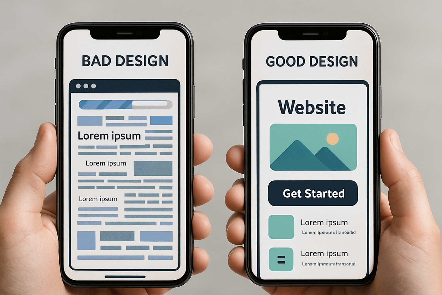
Visual hierarchy means designing your pages so the most important information naturally catches attention first. When everything on your page screams for attention equally, nothing stands out and visitors feel overwhelmed.
Use size, color, contrast, and whitespace to create a clear order of importance. Your headline should be the biggest text element. Your CTA button should be the most colorful element. Your supporting content should be easy to read but visually secondary.
Hierarchy Techniques That Work
Embrace whitespace. Empty space isn't wasted space—it gives visual elements room to breathe and makes your content less intimidating to scan.
Use heading tags correctly (H2, H3, H4) to break up content into digestible chunks. This helps both human readers and search engines understand your content structure.
Limit your color palette to 2-3 main colors plus neutrals. Too many colors create visual chaos that makes it harder for visitors to know where to look.
Group related information together with proximity and visual containers. When elements are close together, viewers naturally assume they're related.
Trust Signals: Proving You're Worth Doing Business With
First-time visitors to your website don't know you from any other business making similar promises. Trust signals are the proof points that tip skeptical visitors toward becoming customers.
In 2026, trust signals matter more than ever. Consumers are savvier and more cautious about who they do business with, especially online.
Essential Trust Elements
Display real customer testimonials with names, photos, and ideally video. Generic praise from "John S." carries less weight than a detailed review from "John Smith, Billings Roofing Contractor" with his photo.
Showcase credentials, certifications, and professional affiliations relevant to your industry. These badges tell visitors you're legitimate and qualified.
Include clear contact information on every page—phone number, email, physical address if you have one. Businesses that hide their contact details look like they're hiding something.
Add security badges near forms and checkout areas. SSL certificates are standard now, but displaying trust badges from recognized security providers still reassures nervous visitors.
Show your team with real photos and bios. Putting faces to your business makes you feel more real and approachable than stock photos of models in business attire.
Accessible Design: Reaching Every Potential Customer
Accessible design means creating websites that everyone can use, including people with disabilities. This isn't just ethically right—it's smart business. About 26% of adults in the U.S. have some type of disability, and inaccessible websites literally lock them out from becoming your customers.
Plus, many accessibility practices improve the experience for all users while also helping your SEO performance.
Core Accessibility Practices
Use sufficient color contrast between text and backgrounds. Light gray text on white backgrounds might look sleek, but it's unreadable for many people. Aim for a contrast ratio of at least 4.5:1 for normal text.
Add descriptive alt text to all images. Screen readers use this text to describe images to visually impaired users. Bonus: search engines also use alt text to understand your images.
Ensure your site works completely with keyboard navigation. Some users can't use a mouse, so everything clickable should be accessible by tabbing through the page.
Caption videos and provide transcripts for audio content. This helps deaf users while also giving you text content that search engines can index.
Content Strategy: Writing for People and Search Engines
Great design can't save bad content, and great content struggles without good design. Your website's words need to connect with visitors while also signaling to search engines what your site is about and who it serves.
For small businesses in Billings and similar markets, local relevance matters enormously. Generic content that could apply to any business anywhere rarely performs well.
Content That Converts
Lead with benefits, not features. Visitors care less about what you do and more about what you can do for them. "We use the latest dental technology" is weaker than "We'll have you in and out in under an hour with zero discomfort."
Write like you talk. Stiff, formal business language creates distance between you and potential customers. A conversational tone builds connection and trust.
Break up text with subheadings, bullet points, and short paragraphs. Online readers scan rather than read word-for-word. Make it easy for them to find the information they're seeking.
Answer real questions your customers ask. Think about the questions people ask during sales calls or consultations, then answer them on your website. This builds trust and improves your chances of ranking for voice searches.
Update content regularly. Fresh content signals to search engines that your site is active and relevant. Even small updates to existing pages can boost performance.
Your home page needs to immediately communicate who you serve and what problems you solve. Visitors should understand your core offering within seconds of landing on your site.
Bringing It All Together: Your Website Design Action Plan
The website design best practices for small business outlined here aren't theoretical—they're the difference between websites that generate leads and revenue versus those that waste money on hosting fees.
Start with mobile optimization and speed. These technical foundations affect everything else and deliver immediate improvements in user experience and search rankings.
Next, audit your navigation and CTAs. Can visitors easily find what they need? Do they know what action to take next? If not, you're losing conversions you should be getting.
Then layer in trust signals, accessibility improvements, and content refinement. These elements transform a functional website into one that builds confidence and drives business growth.
Remember: your website is never truly finished. The best-performing sites evolve based on user behavior, analytics data, and changing customer needs. Plan to review and update your site quarterly at minimum.
If you're in Billings, Montana and need help implementing these website design best practices for your small business, Agency 220 specializes in creating websites that work as hard as you do. We've helped dozens of local businesses transform underperforming sites into lead-generation machines.
Your website should be your best salesperson—working 24/7 to attract, educate, and convert visitors into customers. Make it count.
Frequently Asked Questions
How much should a small business spend on website design?
Most small businesses should budget $3,000-$10,000 for a professional website that follows modern design best practices. DIY platforms like Squarespace or Wix can work for very small budgets ($500-$1,500 including your time), but custom designs typically deliver better results for businesses serious about online growth. The key is viewing your website as an investment that generates returns, not as an expense to minimize.
How often should I update my small business website?
Update your content at least monthly with fresh blog posts, news, or page improvements. Perform a comprehensive design and functionality review every 12-18 months to ensure your site stays current with web standards and user expectations. Technology and design trends evolve quickly—sites that looked modern three years ago often feel dated today. Regular updates also signal to search engines that your site is active and relevant.
What makes a small business website look professional?
Professional websites share several characteristics: fast loading speeds, mobile responsiveness, consistent branding, high-quality images (not obvious stock photos), clear navigation, up-to-date content, obvious contact information, and zero broken links or errors. The design should be clean and uncluttered with plenty of whitespace. Most importantly, professional sites focus on serving the visitor's needs rather than just talking about how great the business is.
Do small business websites need a blog?
Blogs aren't absolutely required, but they're one of the most effective tools for improving search rankings and demonstrating expertise. Regular blog posts give you fresh content to share on social media, help you rank for more search terms, and build trust with potential customers by answering their questions. If you can commit to publishing at least one quality post per month, a blog is worth having. If not, focus your energy on making your core pages excellent.
Should my small business website include pricing?
This depends on your business model and competitive landscape. If you offer standardized products or services with fixed pricing, displaying prices builds trust and pre-qualifies leads so you're not wasting time with people outside your price range. If your pricing varies significantly based on project scope or if you're in a highly competitive market where price alone might scare away qualified prospects, consider showing starting prices or ranges instead. The goal is to provide enough information that serious buyers can self-qualify without immediately eliminating yourself from consideration.